
Collection: Sibling Colors: Understanding the Harmony in Palettes
Understanding Sibling Colors in Design
What are Sibling Colors?
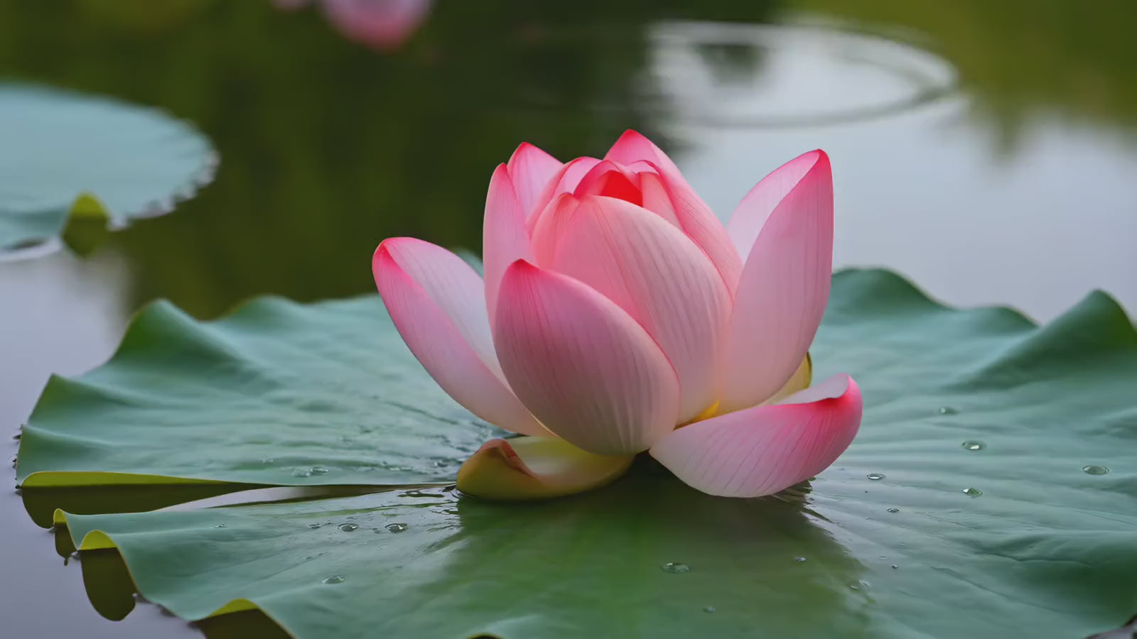
Sibling colors are those hues that are closely related on the color wheel. They offer a sense of harmony and balance, making them popular choices in art and design. For example, blue and green are sibling colors, as they are adjacent to each other. This relationship creates a soft transition in designs, preventing any jarring contrasts. Understanding sibling colors allows artists and designers to create visually appealing compositions with ease.
The Importance of Sibling Colors in Design
Using sibling colors can greatly enhance the overall aesthetic of any work. These colors work well together, so they evoke feelings of calmness and coherence. This is especially useful in branding, where maintaining a unified color scheme helps convey a strong message. For example, a logo that incorporates sibling colors can appear more professional and engaging. Thus, they help in creating memorable visual identities for companies.
How to Use Sibling Colors Effectively
To effectively use sibling colors, choose a dominant color and use its adjacent colors as accents. This approach helps in maintaining balance while adding depth to your design. For instance, if you start with a vibrant orange, pairing it with yellow and red can make your artwork pop. Also, don't forget to consider the context and audience, as color perceptions can vary. So, experiment with different sibling color combinations to see which resonates best with your audience.
-
-

 Regular price $45.00 USDSale price $45.00 USD Regular priceUnit price perFREE ShippingNew
 -
 Regular price $45.00 USDSale price $45.00 USD Regular priceUnit price perFREE ShippingNew


